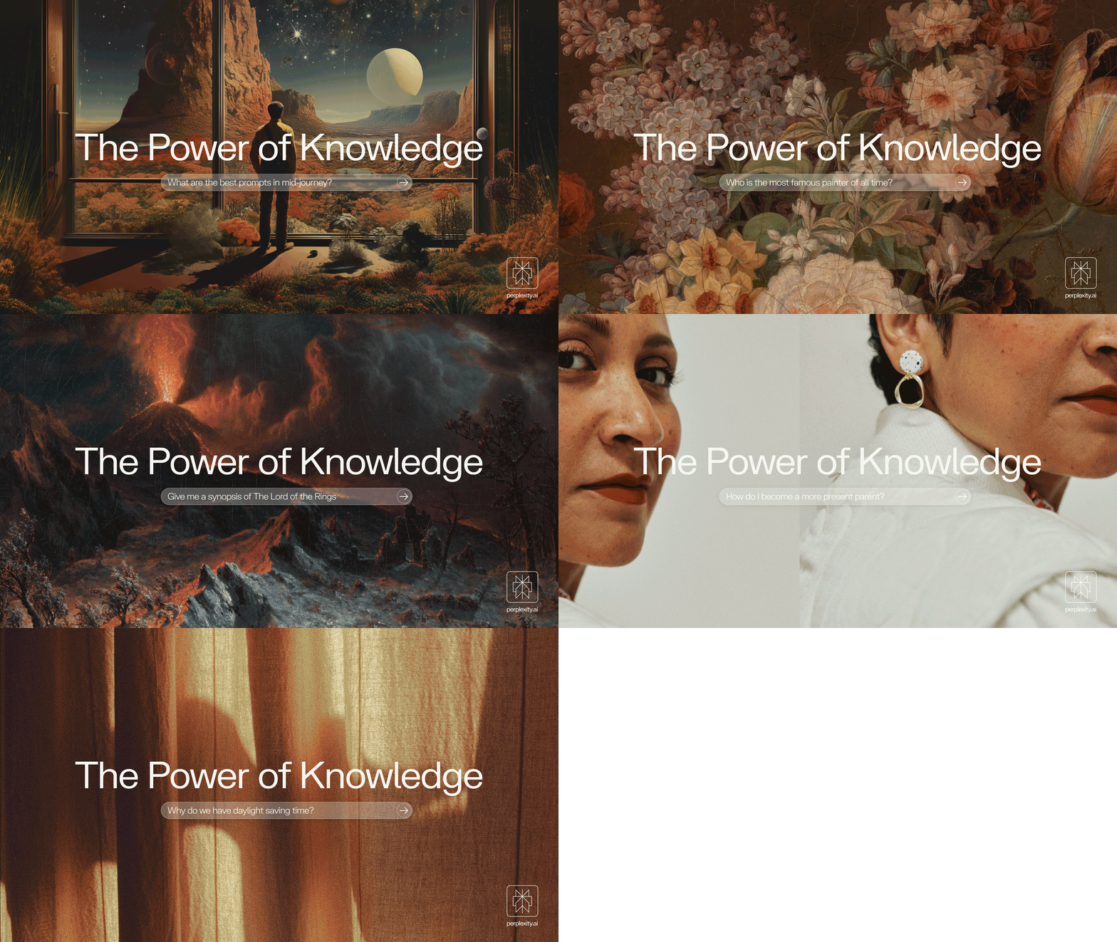
When Henry and Phi from Perplexity hit us up they said, “We want the brand to feel like a Scandinavian subway system. Clean and considered but in an invisible sort of way.” They didn’t want to come across as flashy, or modern, or youthful in any way. Just a vessel for facts.
So uhhhh, that’s not usually our specialty here at S&D. We’re often making wiggly logos with weird mascots and whatnot. But honestly, I’d die for Henry and Phi. We had one of those calls where the line from Step Brothers comes to mind, “Did we just become best friends? Yep.” So we were off to create the most invisible brand we could.
The Symbol
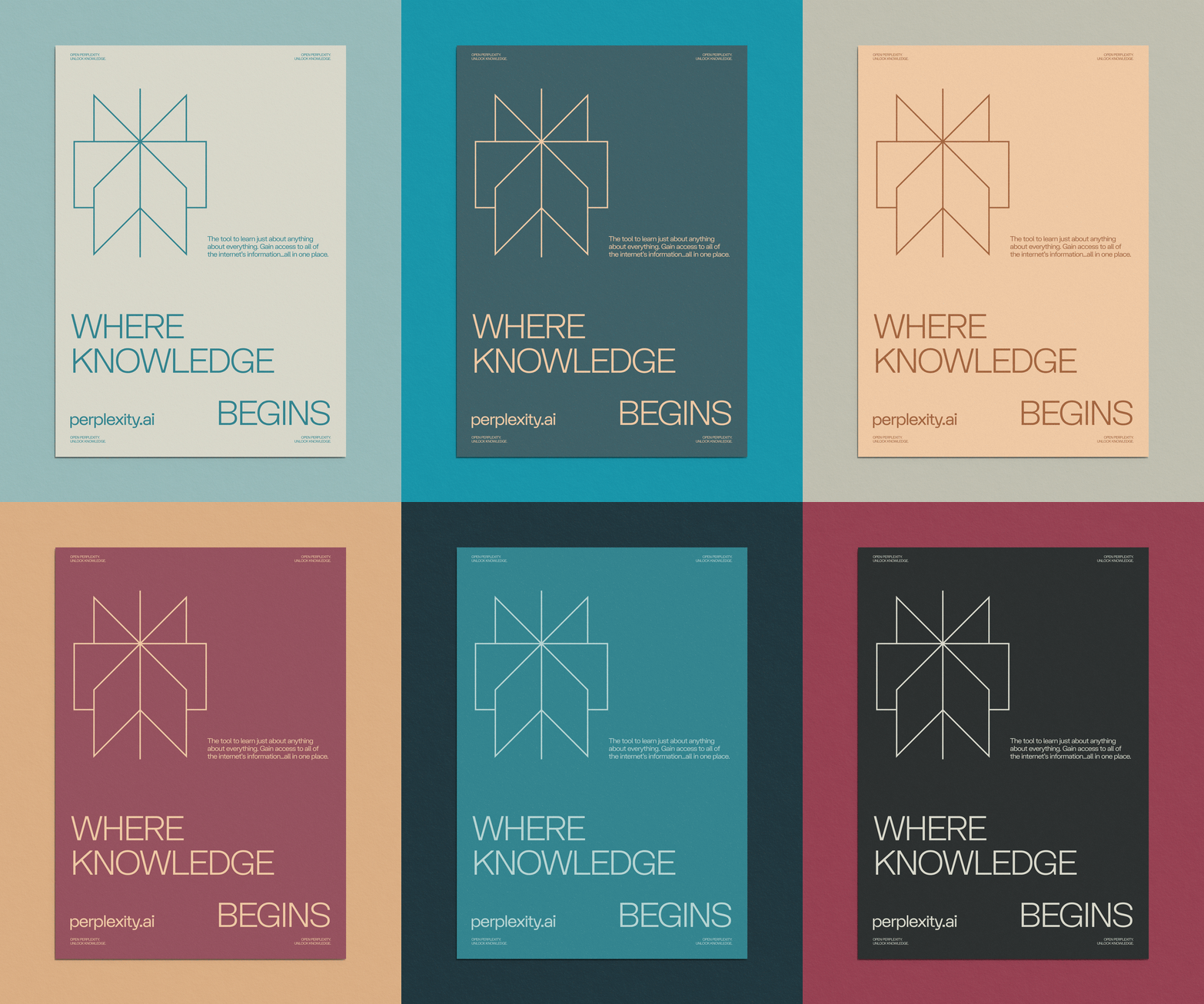
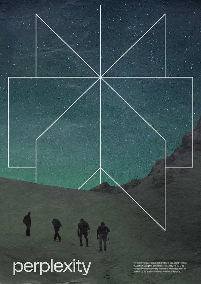
Very similar to our work with Exposure, our job was to change literally everything while at the same time making it seem like nothing had changed at all.We started with the symbol. We wanted to create something that had the same simplicity as the previous logo, but just added a few layers of depth to it. At it’s core, Perplexity is a search engine. It blasts through the internet at unbelievable speeds and summarizes the findings in concise and digestible language. There’s no line of 300 “ads” before getting to the relevant information cough*google*cough. And the thing that separates Perplexity from the rest is that they cite all of their sources, so you can click the link back to the page that this information is coming from to see if it’s actually reputable.
The Wordmark
From there, we dove into the wordmark. We knew we wanted to use a grotesk that had just a smidge of character. Didn’t want to go purely Massimo on this one. We are Smith & Diction after all, so we gotta make things a tiny bit weird. We landed on FK Display which has the absolute perfect amount of personality. The little cuts on the edges of the “X” match the points of the symbol. But there’s also these really tiny hints of softness on the intersections of the p, t, & y. They are almost like pinched ink traps which nods to a bygone era of printed phonebooks and encyclopedias. Will anyone notice these things? Probably not. But the overall feel is also so nice, and hopefully people will notice that.
We also opted for a lowercase “P” which was a discussion that we had for longer than I wanted to—but when people type into their search bars, they usually aren’t using capitalization or grammar or English at all. So we wanted to kind of nod towards that in the identity itself. Also uppercase P’s are a bitch for kerning, you always end up with that terrible gap underneath that throws the balance off of everything.
by
Smith & Diction
/
Read more